
April 28, 2025
Yi Heng Sung
Illustrations for a Japanese free lifestyle magazine Mooi-Mooi in the Netherlands, visualizing emotions and conversations in a feature article about the Dutch healthcare experience.
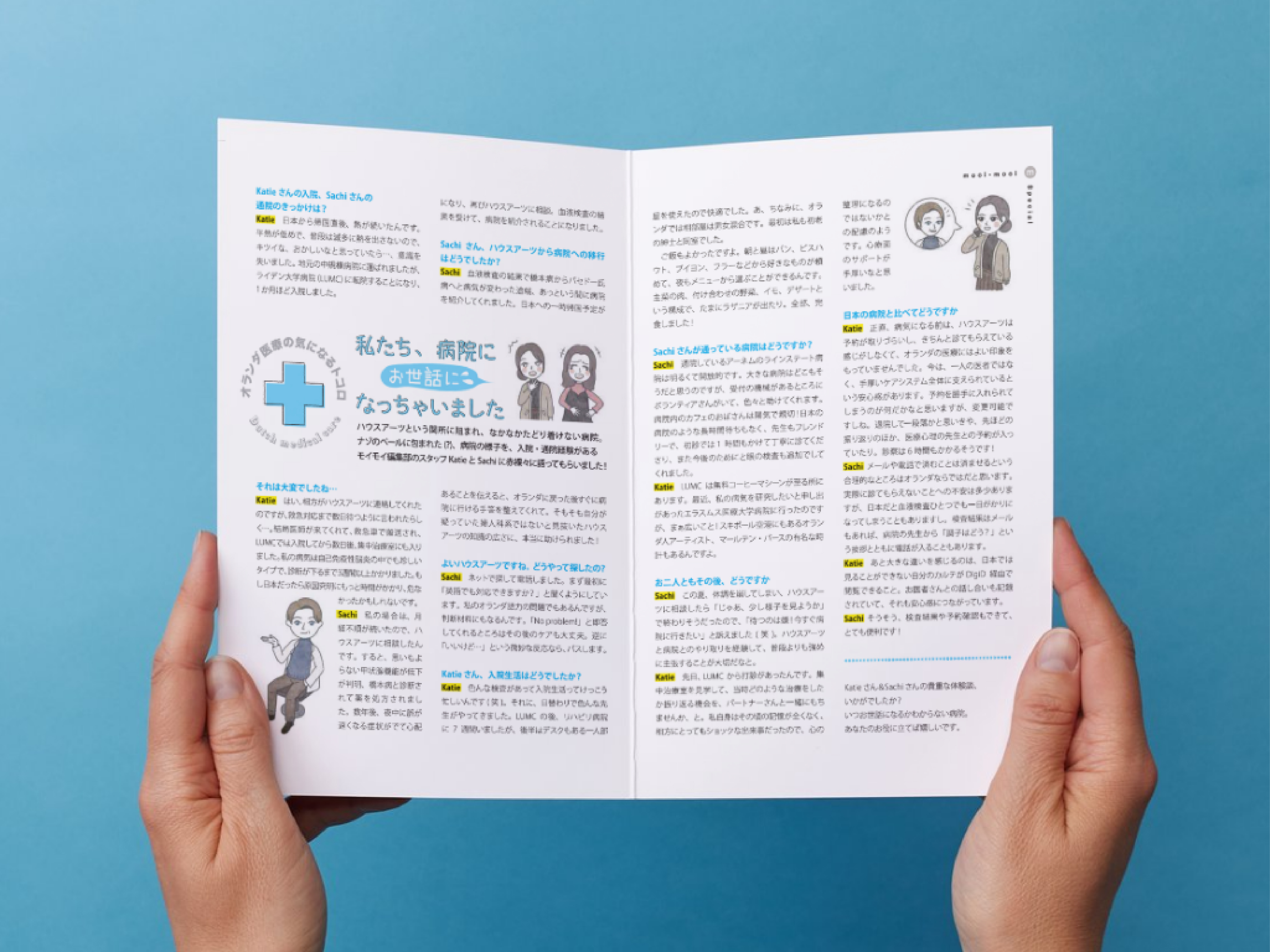
Mooi-Mooi is a free Japanese lifestyle magazine published in the Netherlands, targeting Japanese residents with local tips, brand features, cooking ideas, and cultural insights. In the January 2025 issue (Vol. 32), I contributed illustrations for the feature article「私たち、病院にお世話になっちゃいました」(Roughly translated: “We Ended Up Going to the Hospital”), which shared real experiences of Japanese people using the Dutch healthcare system, highlighting cultural differences and practical tips for navigating medical services in the Netherlands.
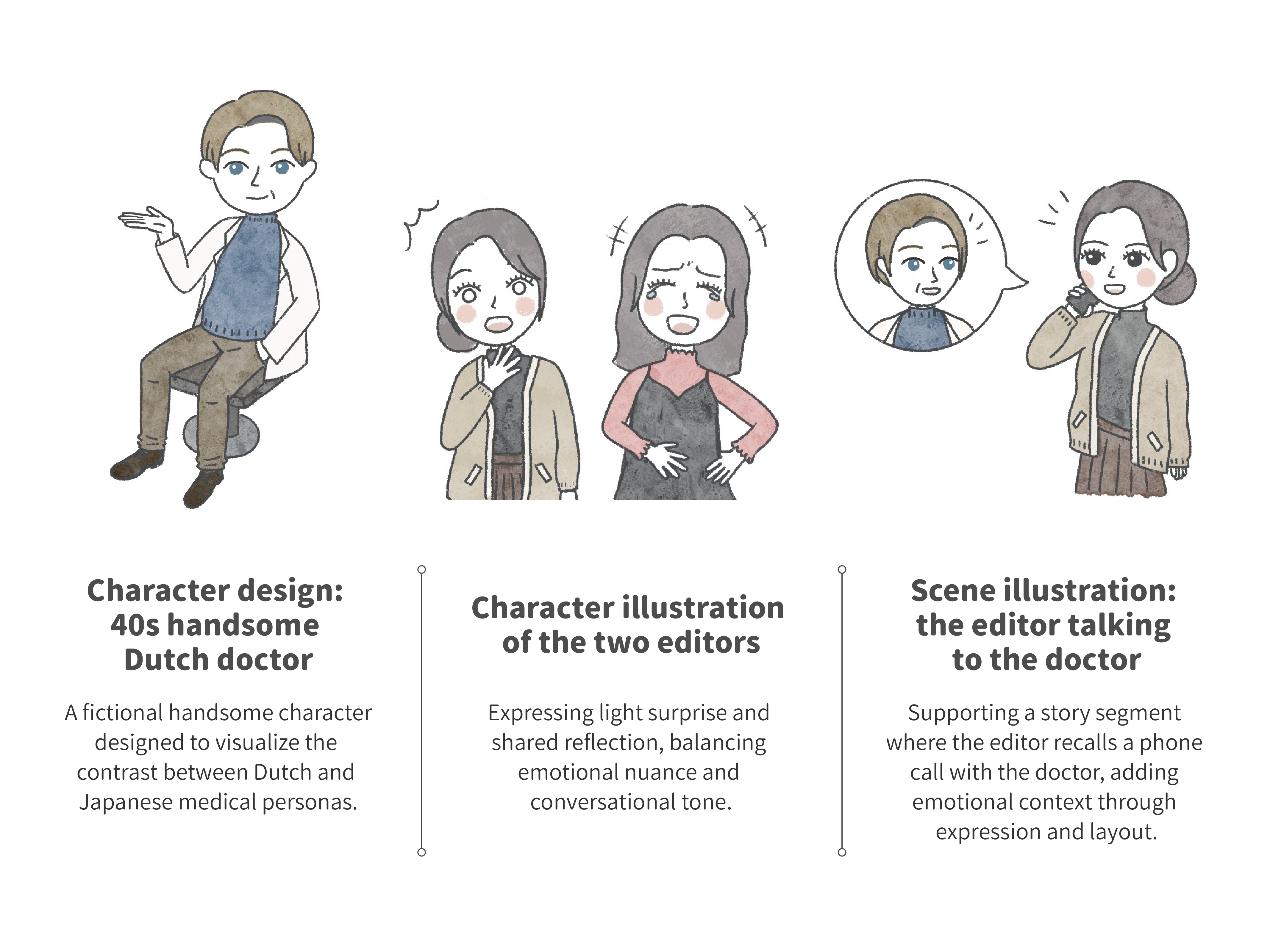
This article was structured as a conversational narrative between two Japanese editors, making it crucial to visually support the dialogue’s tone, emotions, and context. I designed and illustrated three key characters: the two editors and a fictional "40s handsome Dutch doctor. " The illustrations aimed to enhance the narrative flow, clarify character emotions, and provide visual pauses that help readers emotionally connect with the situations described.
I was responsible for designing and illustrating all visuals for the feature article. The illustration style leaned towards Japanese shōjo manga aesthetics—soft, expressive, and emotionally resonant. While the editor had a clear vision for the characters' emotional expressions, I was given full creative freedom to interpret and realize the visuals. I made stylistic decisions regarding color, background minimalism, and line openness to create a warm, hand-drawn feeling that would resonate with Japanese readers.
All illustrations were created using Procreate on iPad, allowing for a flexible and intuitive workflow with attention to detail and subtle emotional cues. For example, the degree of surprise or seriousness in each character's facial expression was fine-tuned to balance the tone of the article—serious but light-hearted, realistic but relatable.
Communication with the editor-in-chief was conducted entirely in Japanese. With my JLPT N1+ fluency and deep understanding of Japanese cultural sensitivities, I was able to clearly understand the editorial intent, propose visual solutions proactively, and explain my artistic choices. The collaboration was smooth and efficient, with all proposals accepted without major revisions.
This project not only highlights my technical illustration skills but also showcases my ability to work cross-culturally and communicate complex emotions through visuals tailored to a specific audience.
#Illustration #Character Design #Cross Cultural Communication #Visual Communication #Magazine Design #Art Direction Support #Collaboration Project #Freelance Illustration

Copywrite: Mooi-Mooi
Download Link: https://mooi-mooi.nl/wp-content/uploads/2025/02/mooi-mooi-vol.32.pdf

Got a thought, a project, or just want to say hi? I’d love to hear from you!